Astley Vineyard:
Giving an award-winning vineyard an identity to be proud of
Established in 1971, Astley Vineyard is a multi-award winning vineyard based in the West Midlands.
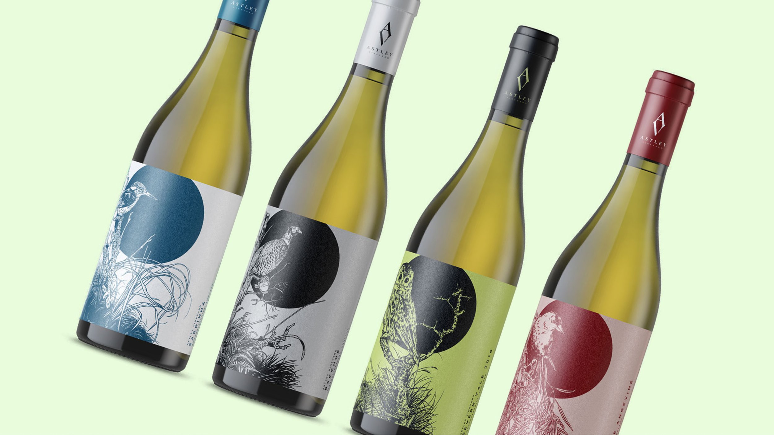
In 2017, the vineyard was bought by a family relocating from London who wanted to bring the Astley brand up to date and better represent the quality of wine that was being produced. We created a fresh and modern identity that gave the brand a premium feel, whilst also allowing it to stand out amongst the crowd on shelves. I worked with an illustrator to produce a series of striking label designs to go across their range of wine’s, focusing on wildlife, particularly birds that can be found at the vineyard.
Since the rebrand, a number of bottles have been picked up by restaurants far and wide, with the highlight being Gordon Ramsay featuring their standout ‘Vintage Sparking Kerner’ wine at one of his restaurants in London.
Work carried out at Wearebeard.

Simple yet premium. The symmetry in the two letter forms helps to create an iconic mark.

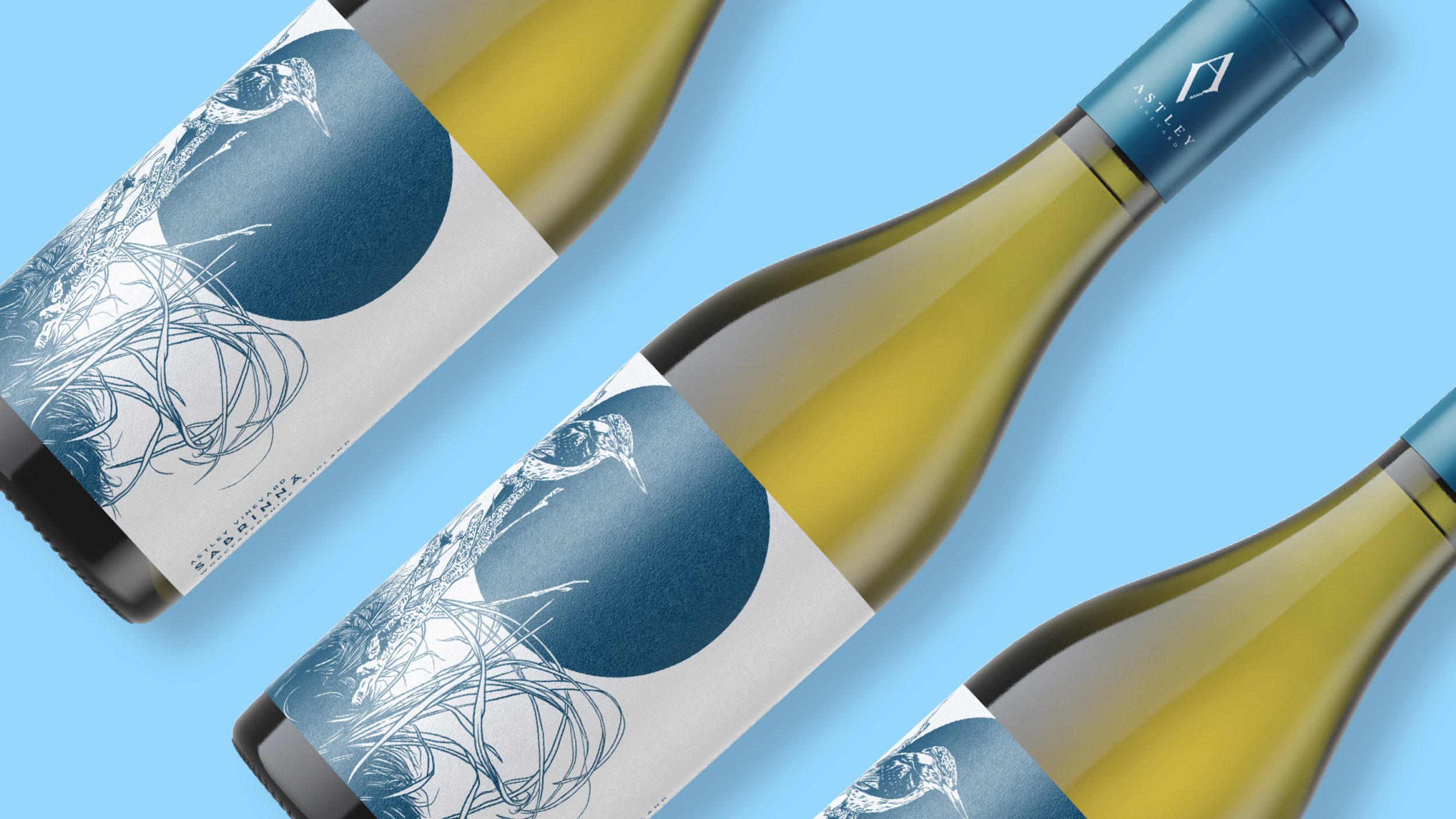
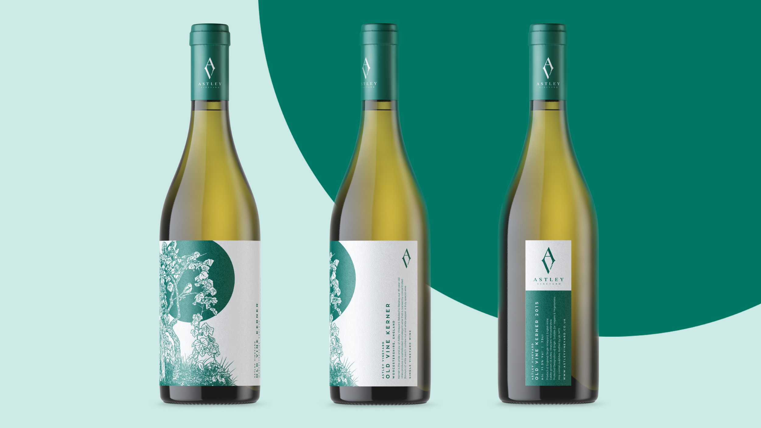
A series of illustrations, based around wildlife that can be found around the vineyard grounds formed the basis of each bottle label design. Illustrations by David Webb.
This visual shows both the front and back label designs.

The tension between the illustrations and solid circles creates a powerful, recognisable visual language.

The dessert wine uses a light colour against a dark background to differentiate it from the standard range.

The Sparking wine label utilised a textured, embossed label with a gold foil finish to create a premium feel.