
TooA:
Branding a disruptive newcomer within the frozen treats sector
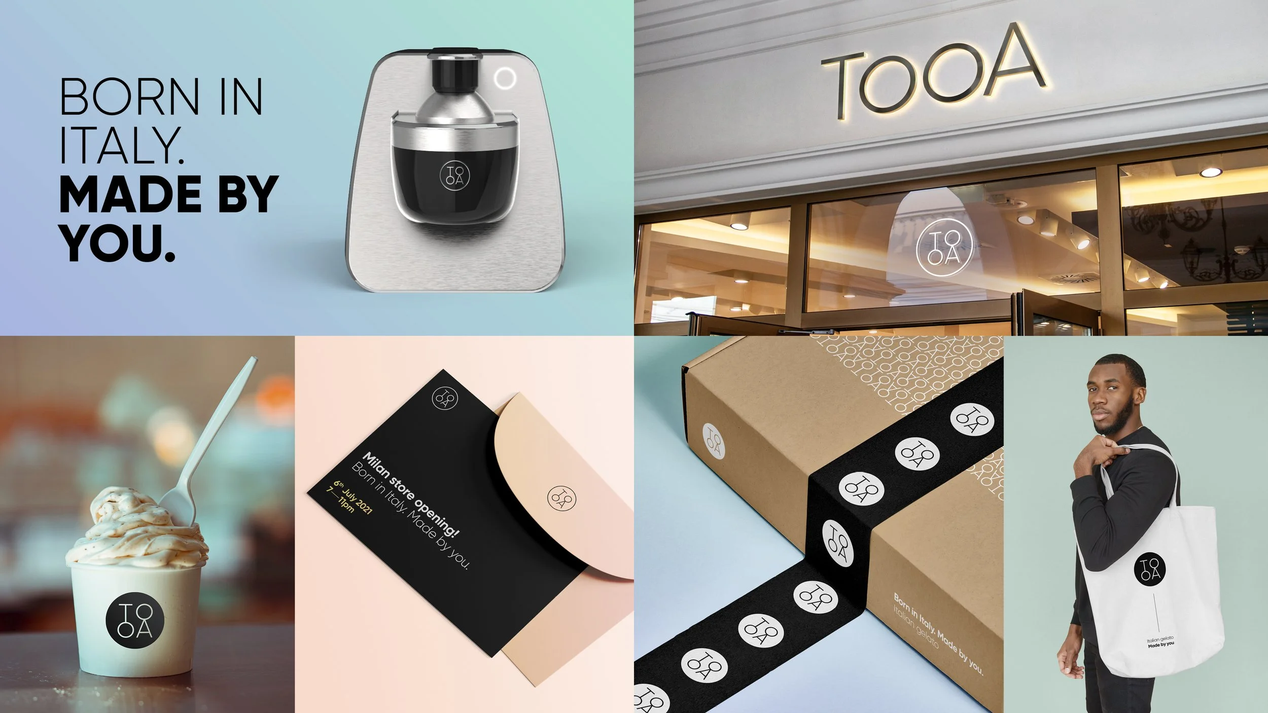
I was fortunate enough to work with an Italian business that had a great idea, and a new technology that they wanted to bring to market - A table top machine that could turn liquid capsules into gelato within 30 seconds.
After the strategy team had worked their magic, I was involved in a lengthy naming process, where we finally settled on the name ‘TooA’. Inspired by the Italian word ‘tua’, meaning ‘your’, ‘TooA’ is short, catchy, unique and brings to life all that the brand stands for: the pleasure of enjoying gelato at home, whenever or however you like it – the choice is ‘yours’.
The name was developed alongside the visual identity, of which I was an integral part of the team that worked to create a modern and powerful expression for the new brand. The product was premium in nature, so each brand element, from colour palette to photography, had to feel elevated and considered.
TooA is now going from strength to strength and has launched several retail locations across Italy, as well as developing a dedicated app and e-commerce website.
Work carried out at Conran Design Group.
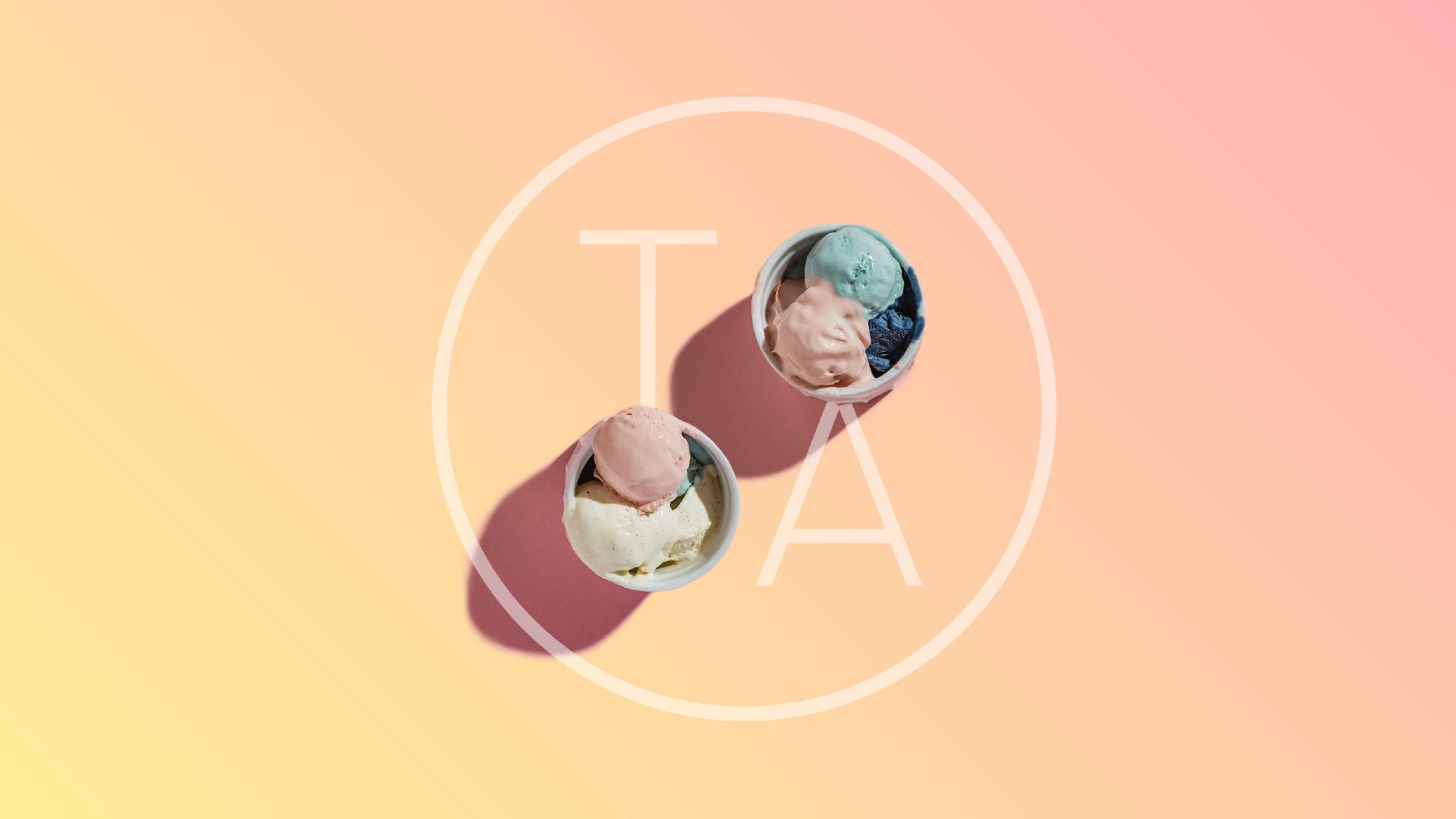
The circular nature of the logo was important as gelato can often be aligned with circular elements such as scoops, tubs and cones. The circle as a shape in general is also approachable in nature.

The brand at a glance. The primary colour palette elevates the premium nature of the product, but with an accessible feel. 'Nero', 'Bianco' and touches of 'Argento', combined with two gradients - 'Mattina' (Morning) and 'Sera' (Evening) - representing the notion that you can enjoy TooA, whatever time of the day it is.


Ingredients are an integral part of TooA and are always featured prominently in brand photography.
