Morgan Motor Company:
Refining an iconic mark
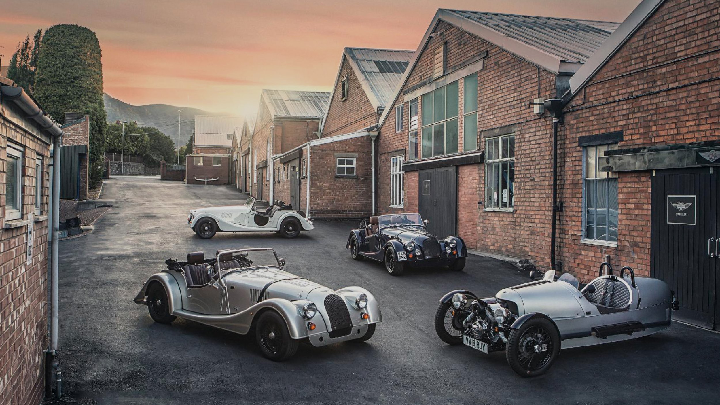
Whilst at Conran Design Group, Morgan Motor Company asked us to work with their in-house design team to help refine and modernise their iconic logo mark.
Their team were at a point where they were about to unleash a brand new, completely different looking logo on the market. We were then introduced and did a series of stakeholder and customer interviews, and it was clear that the Morgan identity as it looked currently was really important to everyone who cherished the brand. So with that, our task became one around simplification and refinement. The strategic insight that our team had gathered helped Morgan to realise just how important certain elements of the current logo, such as the wingspan, the cross and the wheel were to almost every Morgan owner.
After working up hundreds different logo iterations, we presented ‘hop’, ‘skip’ and ‘jump’ directions in terms of how far away from their current mark they could go. Our recommendation was to go with a more modern, refined version of the logo they currently utilise.
Work carried out at Conran Design Group.

A small selection of the logo iterations that were presented to Morgan.

Our recommended direction.