
Worcestershire CCC:
Crafting a new, dynamic brand for an iconic cricket club
Worcestershire County Cricket Club were looking for a new visual identity for their soon to be launched T20 arm of their club, the ‘Worcestershire Rapids’. Being a huge cricket fan, this was a massively exciting project to work on, let alone it being for the team I’ve supported since I was small! The task was to come up with a dynamic, modern brand that created a sense of energy and excitement for the Worcestershire fanbase.
We utilised the name ‘Rapids’ to tie in with (and put a positive spin on) the fact their home ground of New Road is regularly underwater during winter periods due to it’s location on the banks of the River Severn. The indentity utilised surging water around a cricket ball to represent the power and speed that the T20 team would approach the competition with.
In the years that followed a hugely successful launch, I then went on to and create visual styles and art direct photo shoots for several further Rapids season campaigns, such as the ‘Expect Explosions’ campaign that can seen below.
Work carried out at Wearebeard.

Worcester Rapids club crest

A key visual from the 'Expect Explosions' campaign.


Further shots from the 'Expect Explosions' campaign, along with team kit utilising the Rapids logo.
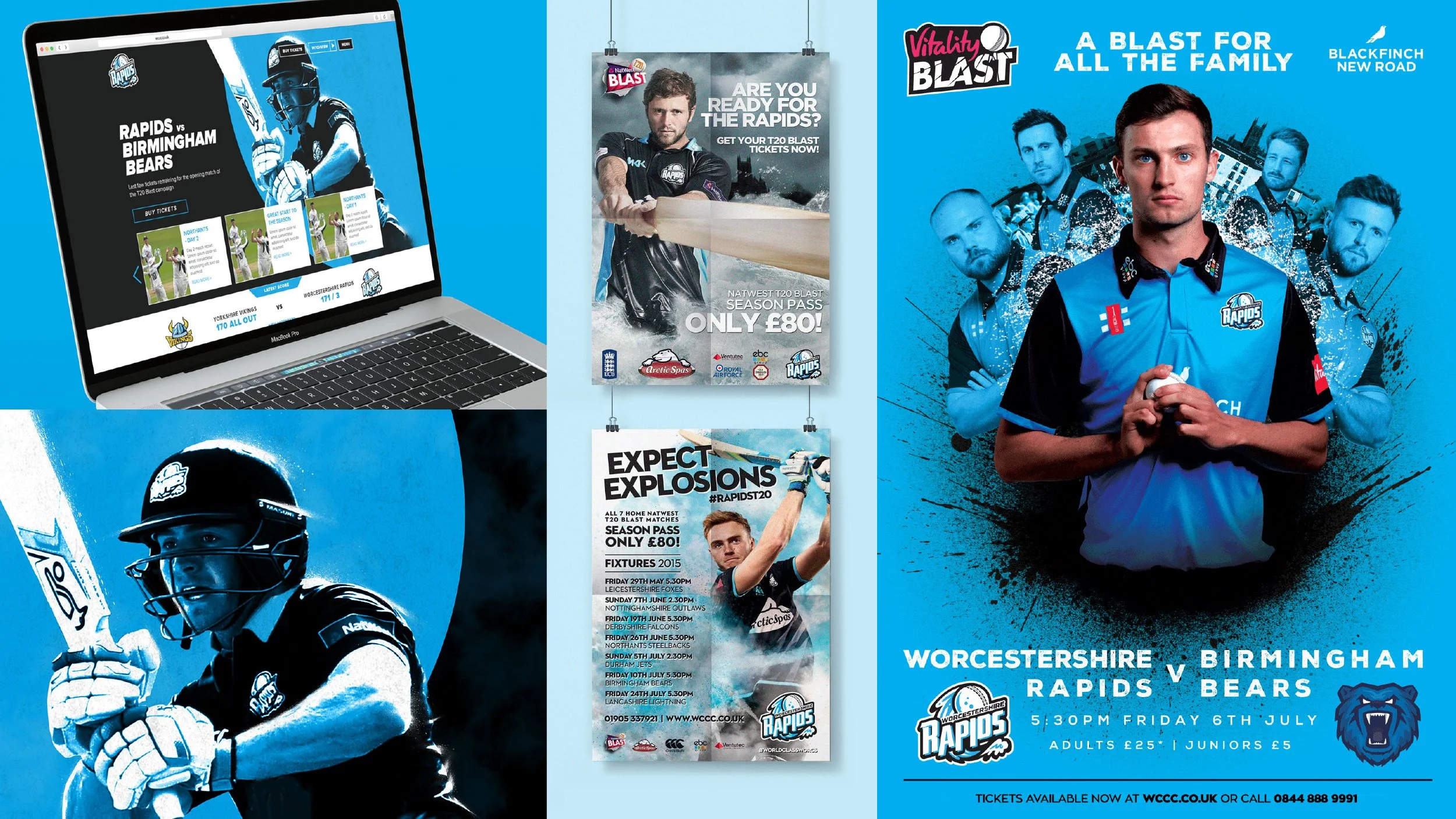
Each seasonal campaign needed to create a sense of excitement and momentum for the season ahead.